Tommy Ryan | Art Director | Richmond, Virginia
  • Branding and Identity
  • Graphic Design and Illustration
  • UX/UI Design
  • About
IDENTITY

VCU Free Store Logo and Brand Style | Summer 2019

Picture
Free Store Brand Style Guide
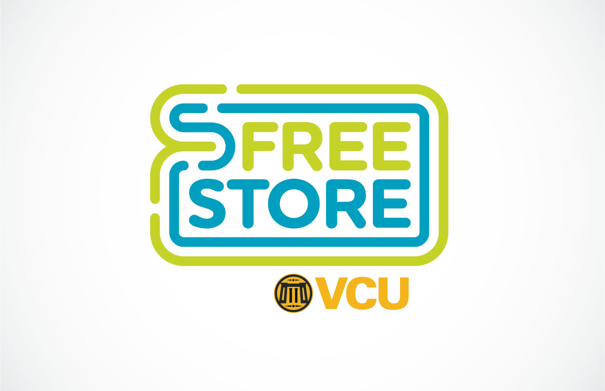
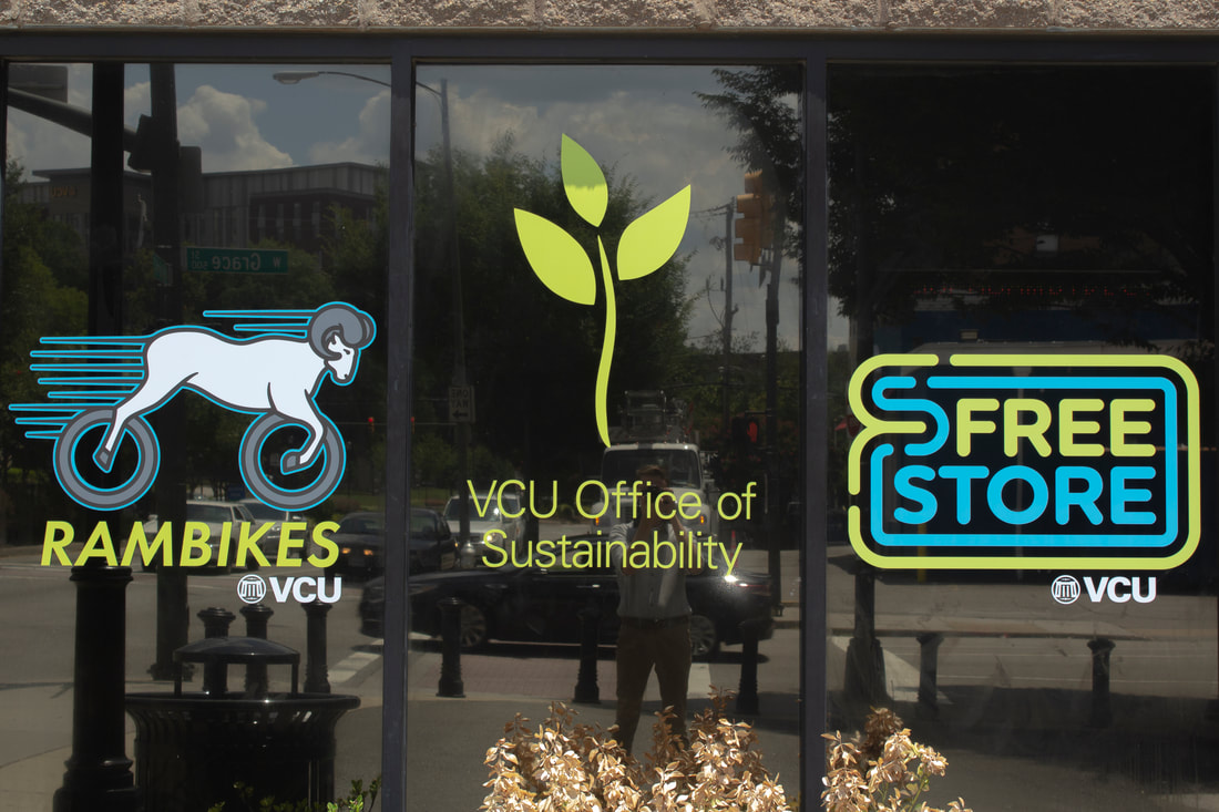
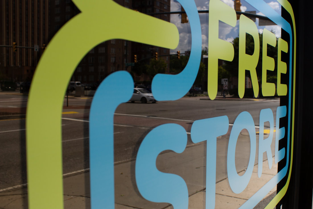
The VCU Free Store is an on-campus resource for students, faculty, and staff at Virginia Commonwealth University. VCU Rams can donate items and take items for free, ranging from pencils and paperclips to TVs and mini-fridges. The Free Store logo is a soft, rounded rectangular form, reflective of a credit card or a bank note. This concept is paired with the vibrant green and blue colors, which suggest recycling of materials, saving money, and maintaining financial security.  The flowing F and S form found in the frame of the logo alludes to the busyness and flow of traffic found at the Free Store's location: the heart of Richmond, VA.

bee b&b Logo Suite | April 2019

bee b&b is an open-source set of 3D printable files. These modules take the form of truncated octahedrons, allowing them to tile in three directions in space. Anyone who downloads these modules can print them and assemble their own bee b&b, consisting of bee beds, flower planters, and structural elements.  The logo involves references to various objects and visual forms involved in the creation of a bee b&b. The most recognizable may be the hexagon, golden yellow and honeycomb-like. Paired with a rectangle, these two shapes make the faces of a truncated octahedron: the building block of the bee b&b. The logo is split into horizontal sections, reflecting not only the stripes of a bee, but the layers of a 3D printed object. And finally, the triangle at the bottom of the form acts as both the stinger of a bee and the nozzle of a 3D printer extruder assembly.
More About bee b&b

PharmaCart Logo Set | April 2019

PharmaCart is a medication distribution cart for use in hospitals. The product places an emphasis on the security of the medications being delivered. This product is in the process of being patented, and the team was in need of a visual identity.
More About PharmaCart

RamBikes Logo Refresh | March 2019

RadiaDerm Logo Set | August 2018

RadiaDerm is a two-part skin therapy system from Water-Jel for patients undergoing radiation therapy. Step one, R1, is a cooling gel, and step two, R2, is a skin protecting lotion. Water-Jel is in the process of rebranding RadiaDerm for their US market, and hired me to establish a logo and a baseline visual identity. 

Food Science Kits Logo Suite | August 2017

Food Science Kits is a startup which is dedicated to helping educators teach their students about different aspects of food science, including agricultural practice, GMOs, and even cooking. I was hired to develop their brand, which is meant to appeal to educators and students alike.

For more work, choose a category!
FEATURED
Data/UI/UX
Print
3D
Picture

Branding and Identity

Graphic Design and Illustration

UX/UI Design

About

  • Branding and Identity
  • Graphic Design and Illustration
  • UX/UI Design
  • About