See the logo that unified the RVA subreddit.

|
|
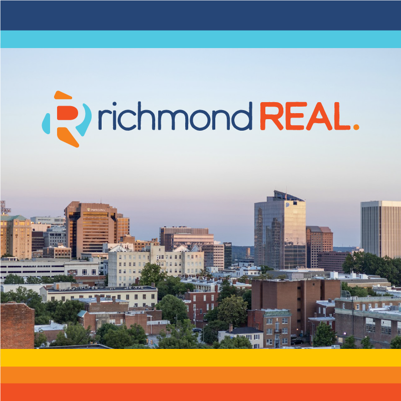
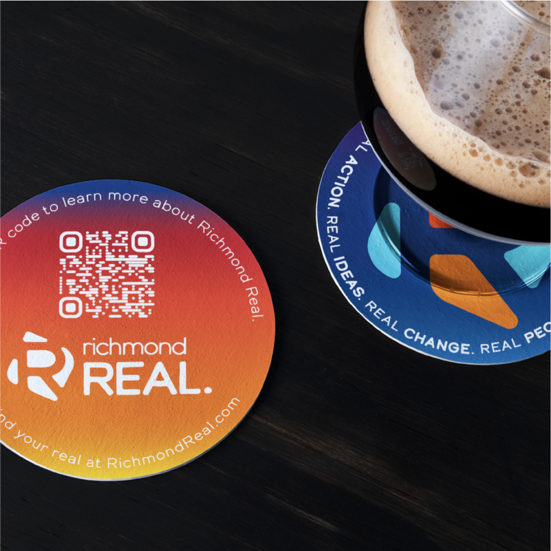
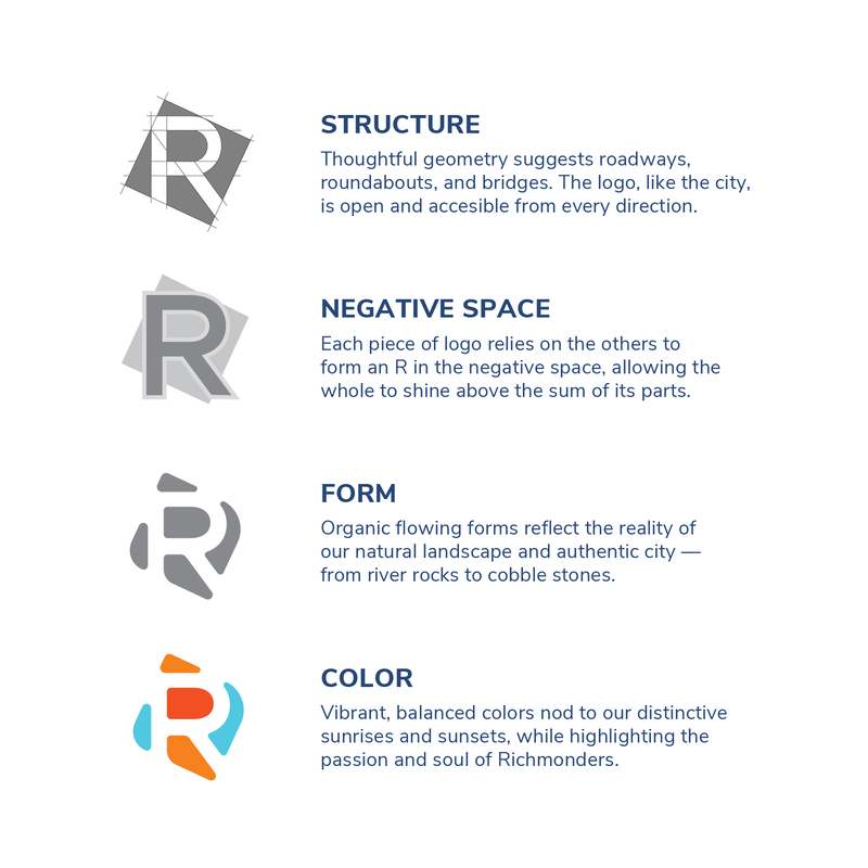
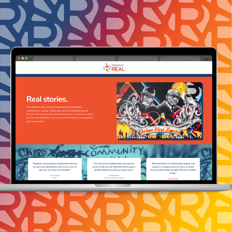
After months of community collaboration sessions with city leaders and citizens alike, Richmond Real was created as a rallying cry for the city to recognize its dark past while moving toward a brighter, more equitable future. Reddit came together and agreed they hated it! With a vibrant, soulful color palette, the logo is built around an "R" to show structure and strength, motion and passion, and authenticity and grit.
Client: City of Richmond, Virginia. Designed at WCG. This work is the property of the City of Richmond. Creative Direction: Melodie Tutwiler and André Johnson. Art Direction and Design: Tommy Ryan.
Stay cool. Even in the city.
|
|
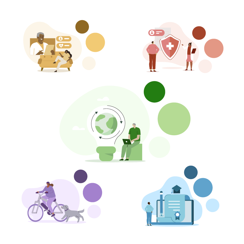
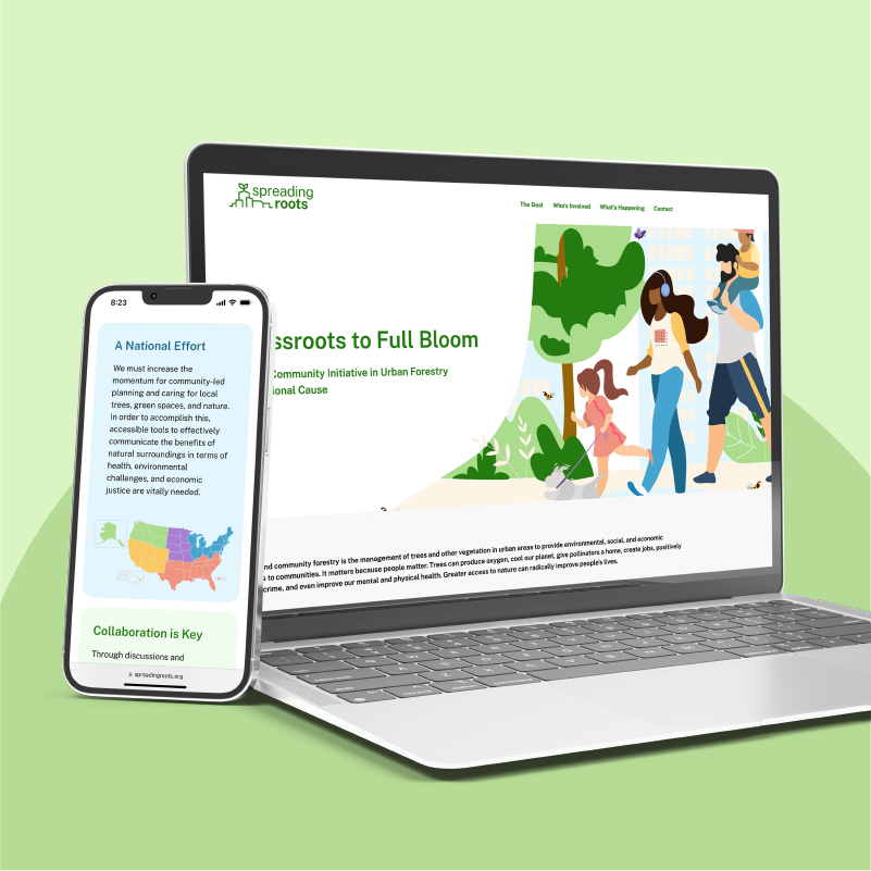
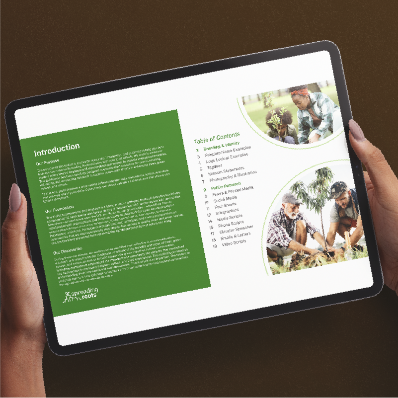
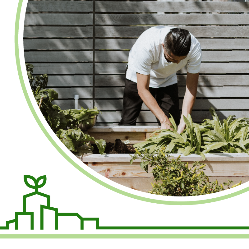
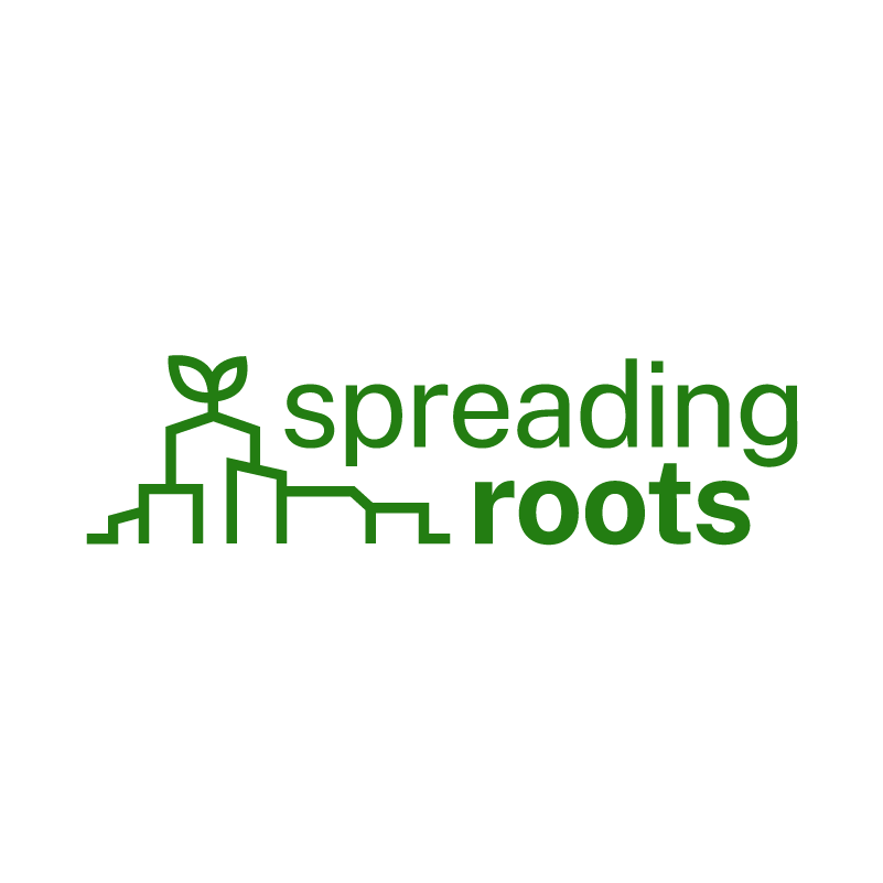
Spreading Roots is an urban forestry initiative created in collaboration with USFS, University of Virginia, and community leaders across the United States and its surrounding territories. A seedling with roots in the shape of a city skyline conveys the project's goals cleanly and easily. The logotype is set in Public Sans, an open source font commissioned by the U.S. government. While green is a clear choice as a main color, it is backed up with varying tints of yellows, reds, purples, and blues to reflect not only the variety of benefits of urban forestry, but also the diversity in experiences and stories lived by all those involved.
Client: United States Forest Service. Designed at WCG. This work is the property of the USFS. Direction and Design: Tommy Ryan
A small neighborhood spreads it wings.

|
|
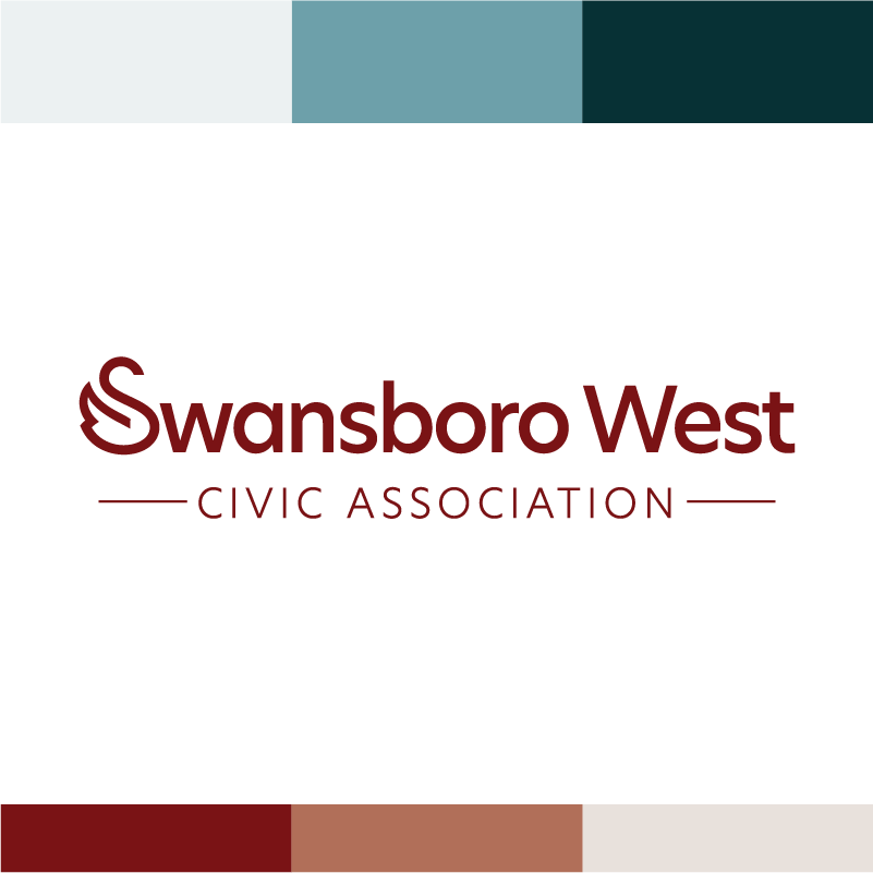
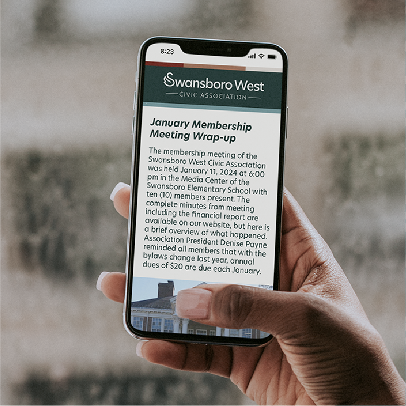
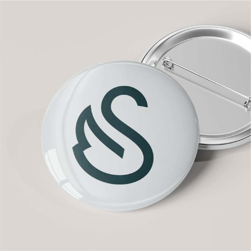
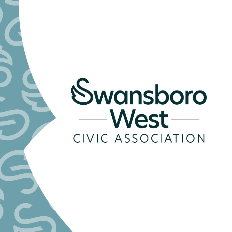
Swansboro West Civic Association represents a vibrant, diverse community nestled between Hull Street and Midlothian Turnpike. A swan-like form takes the place of the capital S, with it's tail feathers facing west. The rest of the name is set in Upgrade: a friendly, yet professional typeface. This logo’s strength is its simplicity and readability. “Civic Association” is set in all capitals to reflect themes of authority and trust. Inspired by the craftsman homes and brick capes found throughout Swansboro West, the soft palette employs a trio of green-blues and a complementary set of warm reds.
Client: Swansboro West Civic Association. This work is the property of SWCA. Direction and Design: Tommy Ryan
Planting for a cooler, more equitable future.
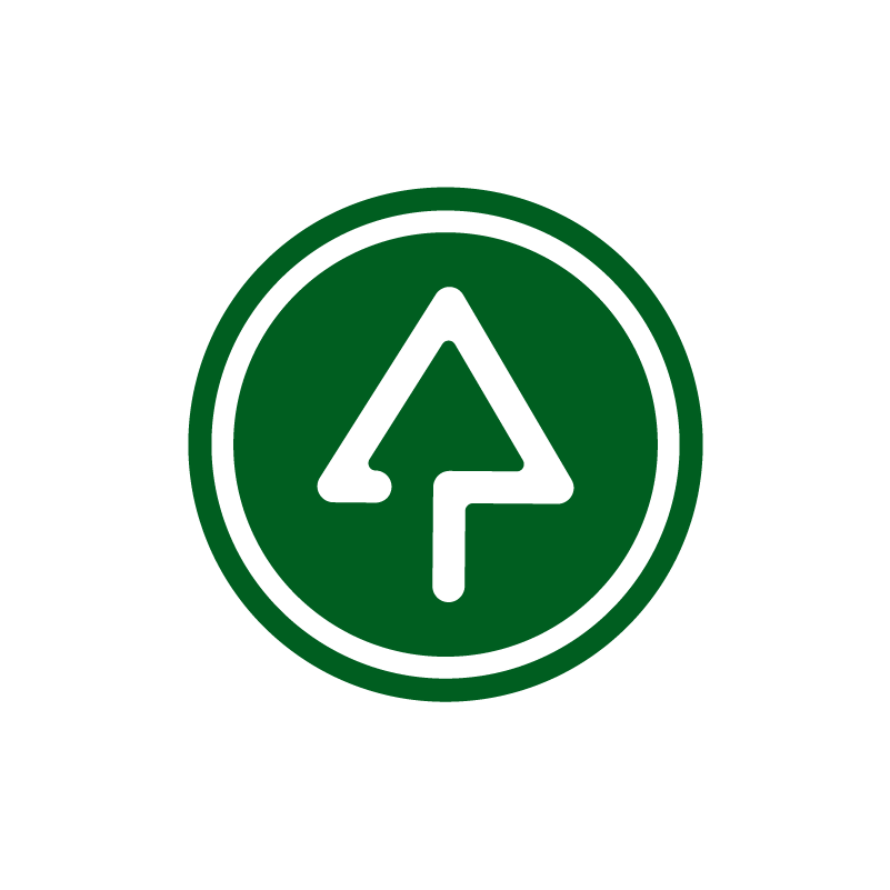
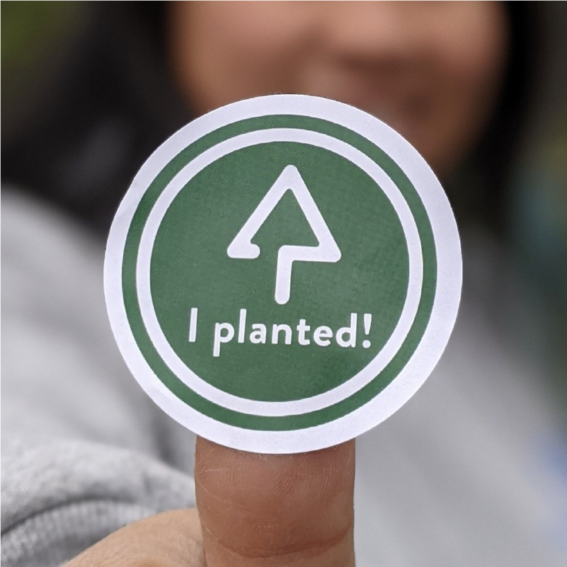
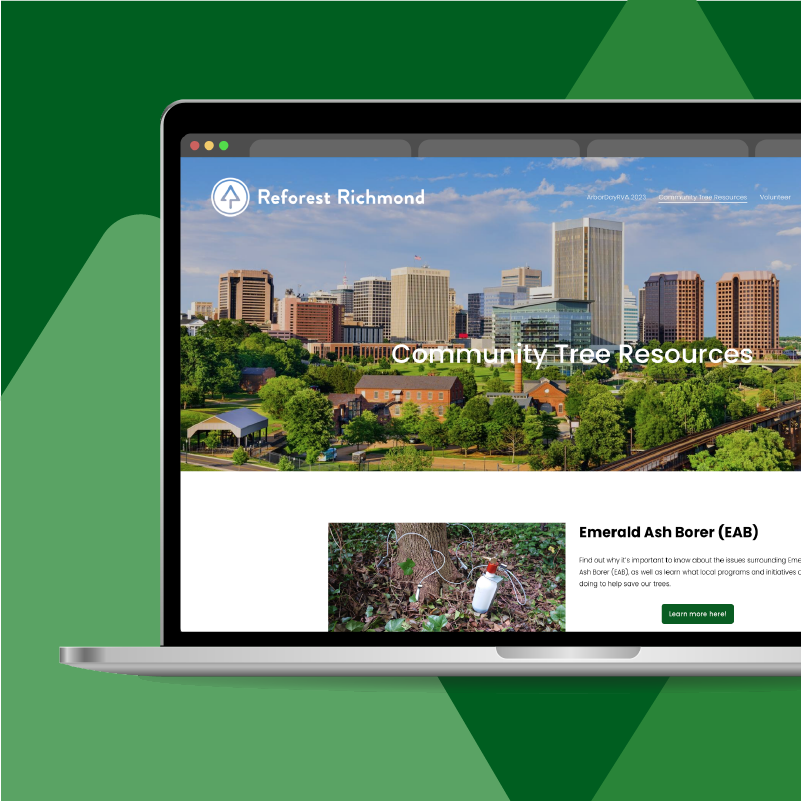
Reforest Richmond is a local entity focused on increasing our city's tree canopy — helping the environment and increasing quality of life. Surrounded by a vibrant, yet deep forest green, the logo mark combines the form of a tree with the shape of an upward arrow: drawing a clear connection between urban canopy and community wellness.
Client: Reforest Richmond. This work is the property of Reforest Richmond. Direction and Design: Tommy Ryan
Free stuff? Sign me up.
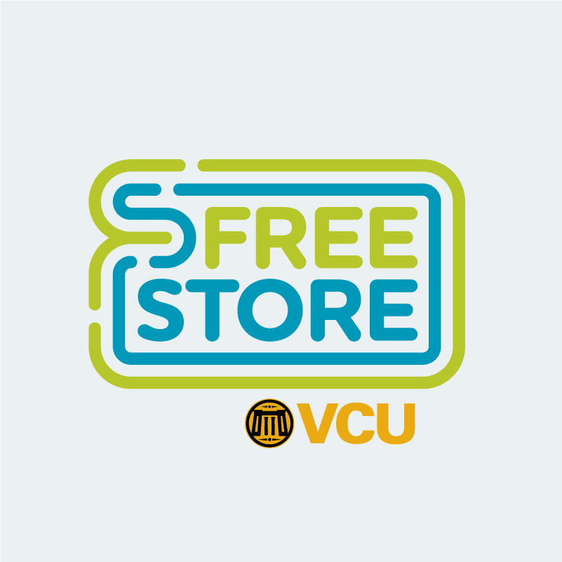
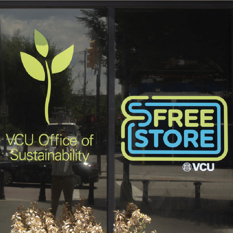
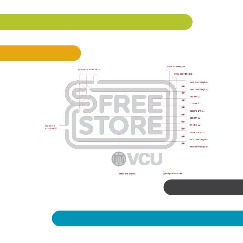
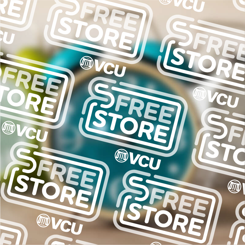
The VCU Free Store is an on-campus resource for students, faculty, and staff at VCU to donate or take home free supplies, furniture, technology, and more. The form of the logo is reflective of a credit card or a bank note. This concept is paired with the vibrant green and blue colors, which suggest recycling of materials, saving money, and maintaining financial security.
Client: VCU Free Store. Designed at VCU Office of Sustainability. This work is the property of Virginia Commonwealth University. Direction and Design: Tommy Ryan