
Here are some of the things I'm good at.
(I’m good at other things too — like gardening and making cocktails — but those don't pay my bills.)

Branding and Identity DesignI design logos and build brand identities. Click that button below and you'll see!
|
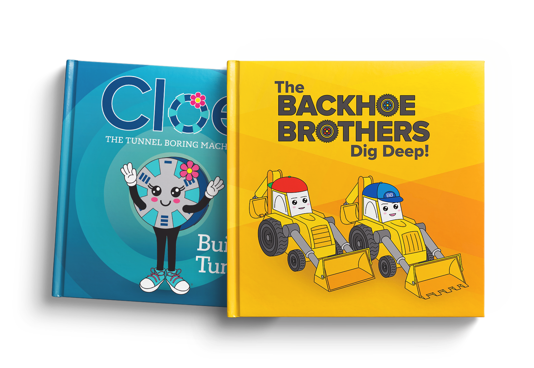
Graphic Design and IllustrationLittle bit of this, little bit of that. Have a look at a sampling.
|
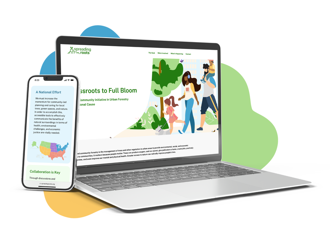
User Experience and InterfaceUX/UI is something people like to see in a portfolio site... good news for me!
|